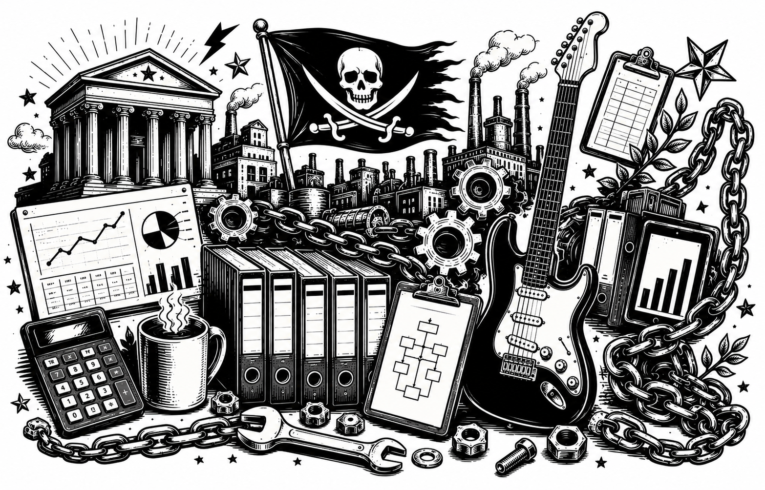
L'architettura d'identità di EurekaGO — valori, posizionamento e principi del brand. Il punto di partenza per ogni decisione di comunicazione.
Document 00 / 15Version 1.0 · May 2026Confidential
01
The Problem We're Solving
Every industry — cycling, accounting, football, logistics — has been generating data for decades. Race telemetry. Transaction histories. Match statistics. Operational records. The data exists. The expertise to interpret it exists. The tools to act on it exist.
What doesn't exist is the system that makes all of it work together. Each piece operates in isolation: the data analyst doesn't speak to the coach, the financial model doesn't know about the athlete's form, the operations software has never heard of the compliance framework.
EurekaGO solves this. Not by inventing new tools, but by building the integration layer — the system that makes the existing pieces finally act as one.
The simplest thing in the world: take the data every industry has been producing for decades and make it work together — one vertical at a time.
The Opportunity
Most AI companies sell tools. EurekaGO sells the system that makes tools produce outcomes. The shift is from "here is a better hammer" to "here is how you build the building."
Why Now
AI capability has outpaced organizational ability to use it. The bottleneck is no longer what AI can do. The bottleneck is integration — and that is exactly what EurekaGO provides.
Validated With
Italian SMEs. The coach metaphor and the system-first positioning were tested and confirmed in the field before becoming brand strategy.
02
The Visionary Gap — Our Core Design Problem
EurekaGO has a vision that is simultaneously vast and specific. Multi-vertical. Multi-market. AI-native. Data-integrated. System-first. The moment you explain the full scope, people do something predictable: they admire it, then they disengage, because it sounds like the future — and the future, by definition, doesn't exist yet.
This is the Visionary Gap: the distance between what we know we can build and what our audience believes is real. The bigger the vision, the wider the gap. And the wider the gap, the harder the sale, the fundraise, the partnership.
The Design Imperative
Every visual decision must make the enormous feel inevitable, not impossible.
The visitor should feel they are looking at something that already exists.
This shapes everything. It is why the brand language draws on institutional authority rather than startup aspiration. It is why the visual system feels operational rather than conceptual. It is why the mark looks like a stamp, not a logo. We are not selling a promise about tomorrow. We are reporting from a destination we have already reached.
The enemy is pitch-deck energy. Every aspirational adjective, every abstract metaphor, every "imagine if" construction widens the gap. We speak instead as someone who knows how the destination is built — because we have already built it.
03
Brand Promise
Promise
EurekaGO does the simplest thing in the world: it takes the data every industry has been producing for decades and finally makes it work together — one vertical at a time.
What This Means
Not a new AI tool. Not a platform. A system integrator that unlocks the value already latent in existing data and expertise — and delivers it as outcomes, not dashboards.
Why "Simplest Thing in the World"
Deliberate counter-positioning. The AI space is full of complexity theatre. We claim simplicity — not because the engineering is simple, but because the value proposition is: data you already have, finally working.
04
The Founding Metaphor — The Coach
EurekaGO does not sell the striker. It sells the head coach — the system that makes the whole team win.
The striker is the AI tool: brilliant, fast, capable in isolation, completely dependent on context to produce outcomes. The coach is what provides that context: the strategic vision, the reading of the game, the empowerment of individual talent, and the operational intelligence that turns effort into results.
This metaphor is not decorative. It is structural. It explains what EurekaGO is, what it isn't, who is accountable for outcomes, and why the system matters more than any individual component.
The archetype of the coach: strategic vision + game intelligence + empowerment of individual talent + tactical and operational efficiency.
Crucially, the coach archetype is not tied to a specific era or a specific sport. It is a role that transcends context — which is exactly what EurekaGO needs as it expands across verticals and markets. The same intelligence, the same system, the same fundamental role — expressed through the native language of each sport.
Context
Sport
Figure
Native language
EurekaGO Italy
Football / Soccer
Allenatore
Tactics board, pressing, set pieces
EurekaGO USA
American Football
Head Coach
Playbook, game film, analytics
EurekaGO UK
Rugby
Head Coach
Set pieces, contact zones, territory
EurekaBike
Competitive Cycling
Directeur Sportif
Race strategy, power data, team radio
Ledgera
Chess · Accounting
Grandmaster · CFO
Balance sheets, cash flow, fiscal strategy
The master brand (EurekaGO) speaks the universal language of the coach — abstract, systemic, authoritative. The verticals speak the native language of their sport — concrete, visceral, insider. This two-tier system allows EurekaGO to be simultaneously global and deeply local.
05
Brand Personality
The personality of EurekaGO is a trajectory, not a fixed point. It begins with an attitude and builds toward an authority — and the order matters. Credibility is earned through the quality of execution, not assumed through the tone of communication.
Foundation — Where We Start
Pirate energy. We move fast and challenge conventions.
Startup attitude. We don't ask for permission.
Restless curiosity. We don't accept "that's how it's done."
Builder confidence. We show, we don't pitch.
Irreverence toward complexity. We make hard things simple.
→
Aspiration — Where We're Heading
Systemic authority. The system wins, not the individual.
Operational clarity. We know exactly how it works.
Quiet confidence. We don't need to tell you we're good.
Institutional solidity. We're still here in five years.
Earned gravitas. The work speaks first.
The founder embodies this trajectory. The identity must radiate energy before seriousness, and earn credibility through execution quality rather than institutional tone. Never rigid. Never corporate. Never "we are a serious company" — that's a claim, and claims are cheap.
06
Creative Territory — The Winning System
The creative territory of EurekaGO is the locker room of a team that has won five championships in a row. Not the trophy room. Not the press conference. The locker room — where the system is visible, where you can see how the winning is actually made.
This territory is defined by the conviction that the system is the competitive advantage, not the individual talent. It carries the weight of accumulated intelligence, tested frameworks, and operational precision — but it never loses the energy of people who genuinely love the game.
01
Operational, not aspirational
We speak from inside the system, not from outside looking in. The language is that of someone who knows how the destination is built — because they've already built it.
02
Movement with aesthetic
Energy and beauty are not opposites. Reference: Rapha — the cycling brand that made professional aesthetics accessible and aspiration feel earned, not purchased.
03
Global-first, Italian by soul
Italianità is invisible. Like Linear, Arc'teryx, or Loro Piana — the origin is felt in the precision of the work, never stated in the language.
04
The stamp, not the logo
The mark functions as an institutional seal — the kind of mark you find on equipment used by winning teams. Authority at small scale. Presence at large scale.
05
Azure as the live signal
In the visual system, azure is the only element that is "alive." Everything else is structure. Azure signals the operational layer — where the system is actually running.
06
Concrete and human, never abstract
No maps. No coordinates. No "imagine if." Every communication is anchored to something concrete — a sport, a role, a specific outcome, a real number.
07
Audience Architecture
EurekaGO speaks to three distinct audiences simultaneously, and the brand system must work for all three without compromising its integrity for any of them.
Primary
B2B Clients
Organizations seeking AI-driven transformation. They need to feel that EurekaGO is already operating at scale — that the system exists and is proven, not being built while they wait.
Secondary
Investors & Partners
Capital and strategic partnerships. They need to see a coherent architecture — one brand, multiple verticals, a credible expansion logic — and feel the ambition is earned, not asserted.
Tertiary
B2C via Verticals
End users of vertical products. They will rarely engage with the master brand directly — but when they see the endorser mark, they should feel quality and trust.
08
Brand Architecture
EurekaGO operates as a visible endorser brand — the model used by "A Google Company" or "An LVMH Maison." The master brand appears on vertical products as a quality signature, not as a dominant presence. It says: this product has been built within a system. That system is EurekaGO.
Master Brand — EurekaGO
Abstract / Universal. Speaks across all verticals. Uses the coach archetype without sport-specific language. The visual system is systemic — geometry, structure, azure signal. No explicit sport references.
Endorser Role
The EurekaGO wordmark (Tiny / Endorser version) appears on all verticals. Positioned as secondary to the vertical brand. Prefix: "Powered by" or "An EurekaGO product."
Vertical Brands
Sport-native / Explicit. Each vertical speaks the native language of its discipline — race data for EurekaBike, accounting precision for Ledgera. The visual language can be distinctive and sport-specific.
Fuchsia Rule
Fuchsia exits the master brand entirely — it is a vertical property. The master brand palette is Black, White, Cream, and Azure only.
09
What We Are Not
Defining the negative space is as important as defining the positive. These are the directions explicitly ruled out — not by aesthetic preference, but by strategic necessity.
Not This
Pitch-deck energy
Aspirational language, "imagine if" constructions, future tense about capabilities we have today. This widens the Visionary Gap instead of closing it.
Not This
Abstract metaphors
Maps, coordinates, survey grids, constellation charts. These were explored and rejected. They are intellectually interesting and emotionally inert.
Not This
Institutional rigidity
"We are a serious company." Seriousness claimed through tone is unconvincing. Seriousness earned through execution is unassailable. Never rigid. Never corporate.
Not This
The striker, not the coach
Selling AI tools, AI features, AI capabilities as the primary value proposition. The tool is the striker. EurekaGO is the system that makes the striker worth the transfer fee.
Not This
Typographic cleverness as mark
Logos built by modifying letterforms, letter-stacking, or visual wordplay. The mark must be a glyph with its own logic — not a letter that has been art-directed.
Not This
Visible Italianità
References to Italian design or culture as brand positioning. The origin is felt in the quality of execution — never stated, never used as a differentiator.
10
From Strategy to System
Every decision in the visual identity system that follows from this document can be traced back to one of the principles above. This is not a coincidence — it is the discipline of coherent brand design.
The Mark
A trapezoid with an exclamation cut out of it, produced by a single diagonal pass across the wordmark rather than drawn as a separate device. One cut, one shape, no ornament — the simplest thing in the world, made literal.
The Type
Archivo, a neo-grotesque under an open licence, in six weights. Chosen because it is unremarkable at a glance and precise up close: authority comes from what is written, not from a typeface performing seriousness.
The Color
Azure is reserved for interactive and operative elements only. It is a signal, not a decoration — where it appears, something works. A palette that colours everything tells the reader nothing, which is complexity theatre arriving by another route.
The Motion
The mark is static in ink and on paper. The Halo System adds three concentric azure bands, animated in sequence into the "Respiro" pattern, and it is the only element that moves. Restless curiosity, expressed once rather than everywhere.